
Case Study: Cryptocurrency wallet User Interface
Improving coinme wallet application features and visual brand experienceBased in Seattle, Coinme is a leading digital currency exchange on a mission to provide everyone with access to secure and easy-to-use digital currencies. Our team was tasked with designing a dashboard concept and improve the overall usability of Coinme's cryptocurrency wallet application.
My responsibility for this project was to solve Coinme's brand communication challenge by improving visual design standards throughout the application. I collaborated with UX designers and a product manager on improving application features based on market needs and competitive products by providing creative strategy consultations and visual design concepts. My deliverables included brand guidelines, optimized graphic assets generation, hi-fi comps, UI kit and redlines for final design hand-off.
Discovery + Research
Our team determined certain characteristics and features that defined user goals by gathering existing data, conducting interviews with users, SMEs, and devOps team members.
UX Challenge
problem (from user's point of view):
Users need a way to easily manage cryptocurrencies in one place because users are wating time and money constantly transferring funds between exchanges. How might we design a product that provides users an alternative to using multiple changes and portfolio tracking applications, allowing users to easily manage, send and receive their cryptocurrencies in one place?
At this stage, my focus was to define the current state of Coinme's visual brand and its position in the market through site audits, interview analysis, heuristic evaluations, and competitive/comparative analysis.
Visual Brand Audit
Key insights from stakeholder interviews, site audits, and brand truths discovered through user and market research helped me define the following brand communication problems:
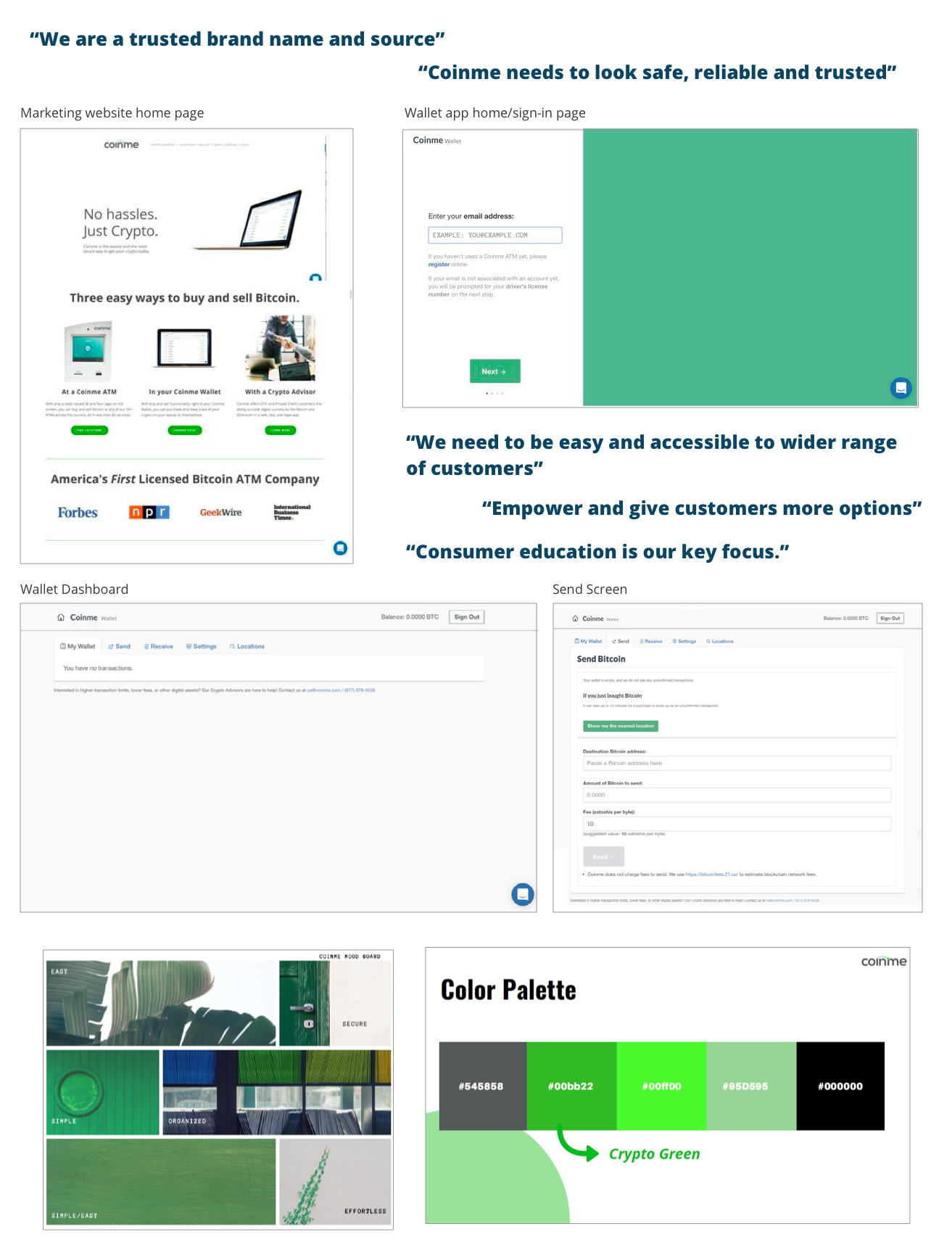
Brand Communication Challenge
problem (from business point of view):
(A) The Coinme Wallet landing page doesn't match up with it's core product website counterpart. Users have an inconsistent experience, feeling a disconnect with the product and brand due to the difference between the two identities look-and-feel.
(B) The Coinme Wallet experience does not offer attractive visual content and easy access to useful information. Users have a hard time connecting with the brand and are often unsure about how to navigate through the product's features.
The challenge is to create a visual language for the wallet app that is both approachable and high-end, instilling user trust in the product's integrity and enhancing the sense of security. Additionally, the design should enable users to confidently engage with the wallet's features, easily explore and discover data, and find and identify key actions. By achieving these objectives, we can deliver a user experience that encourages user adoption, engagement, and loyalty.
Creative Strategy
Competitive/comparative analysis
Benchmarking of competitor website and comparison of non-cryptocurrency brands in finance or banking industries. Analyzed visual branding and user interface designs to determine current trends and assess competitor intitatives.

Below are some key findings and benchmarks:
- Mix of buttons and container elements with rounded corners + right angles/sharp corners
- Blue hues remain dominant throughout banking websites - often sign of reliability, responsibility and trust. Financial brands continues to trend shades of green, evoking feelings of abundance, wealth, growth, and vitality. Accent gradients to draw attention to specific features.
- GEOMETRIC SHAPES: Shapes with straight lines and angles usually symbolise structure and order, while the shapes with curves are softer and represent connection and community.
- SQUARES AND RECTANGLES: These shapes represent stability. it is a trusted familiar shape that represents honesty, solidity and stability. As squares and rectangles have straight lines and right angles they have a very mathematical, balanced feel. These shapes scream rational, practical and conformity.
Wireframes
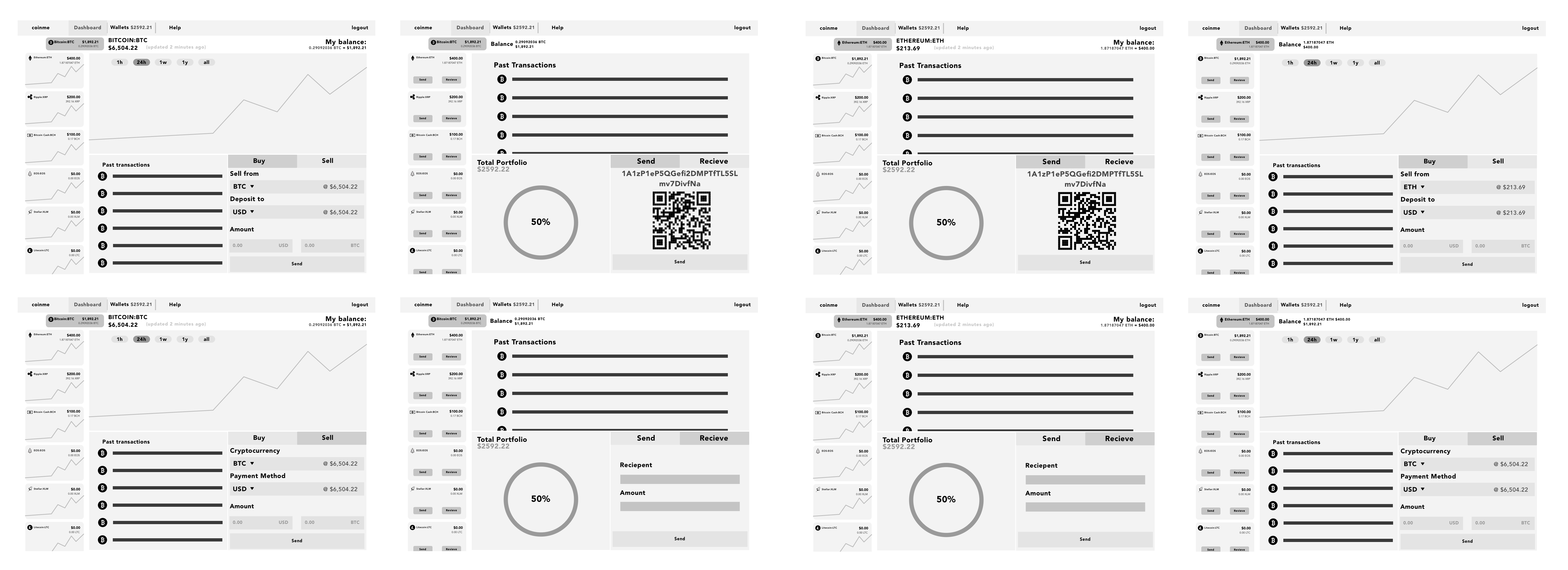
Received initial low-fidelity wireframes from our interaction designer to use as a guide for developing visual design assets and final high-fidelity comps.
Visual Design
Design Language
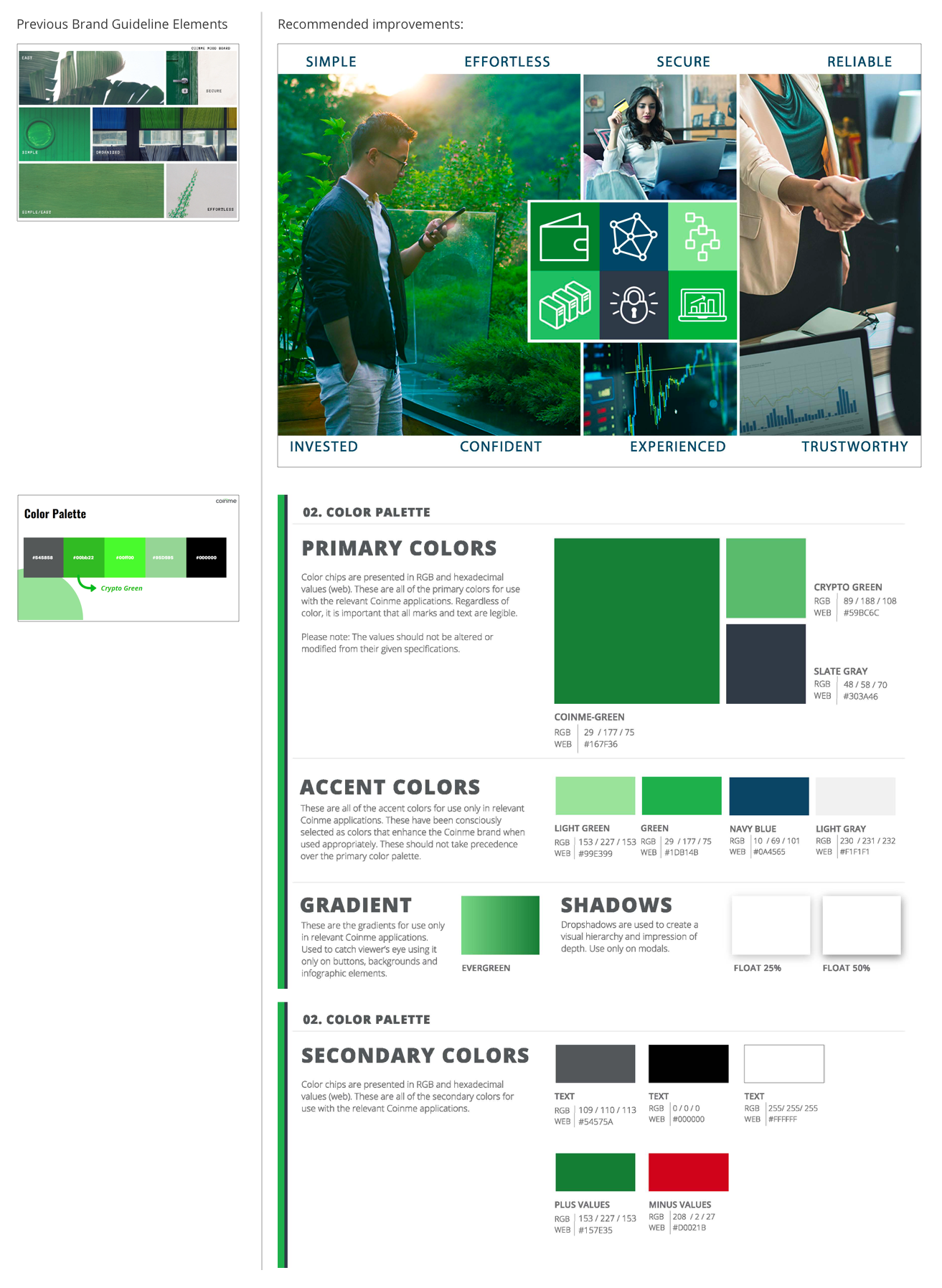
Recommendations to improve brand identity by redefining tone-and-voice to align better with company vision; enhance color palette and visual design to increase brand recognition, strengthen its message and reinforce the impression that Coinme is a trusted leader in the industry.
UI Kit & Styleguide
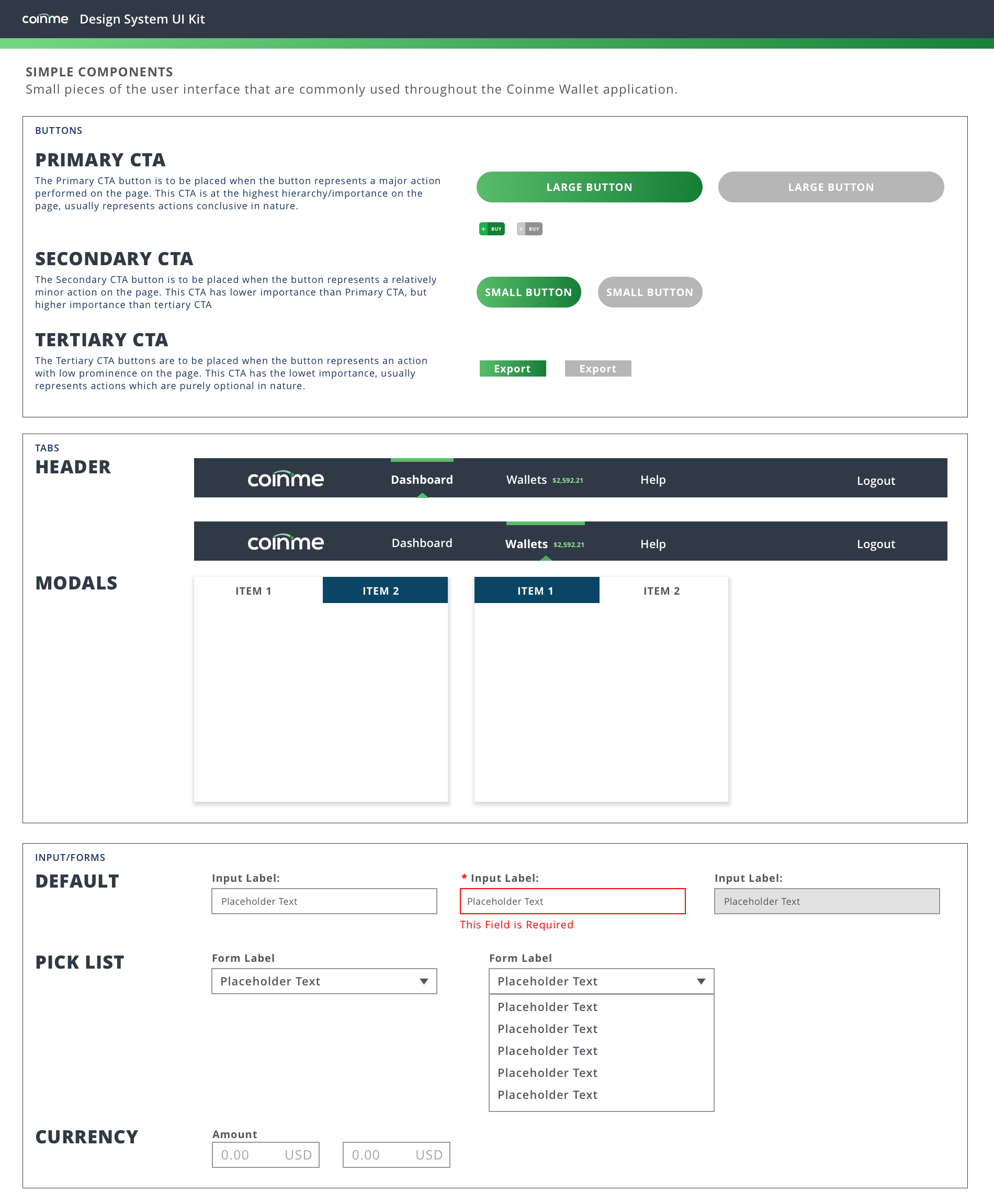
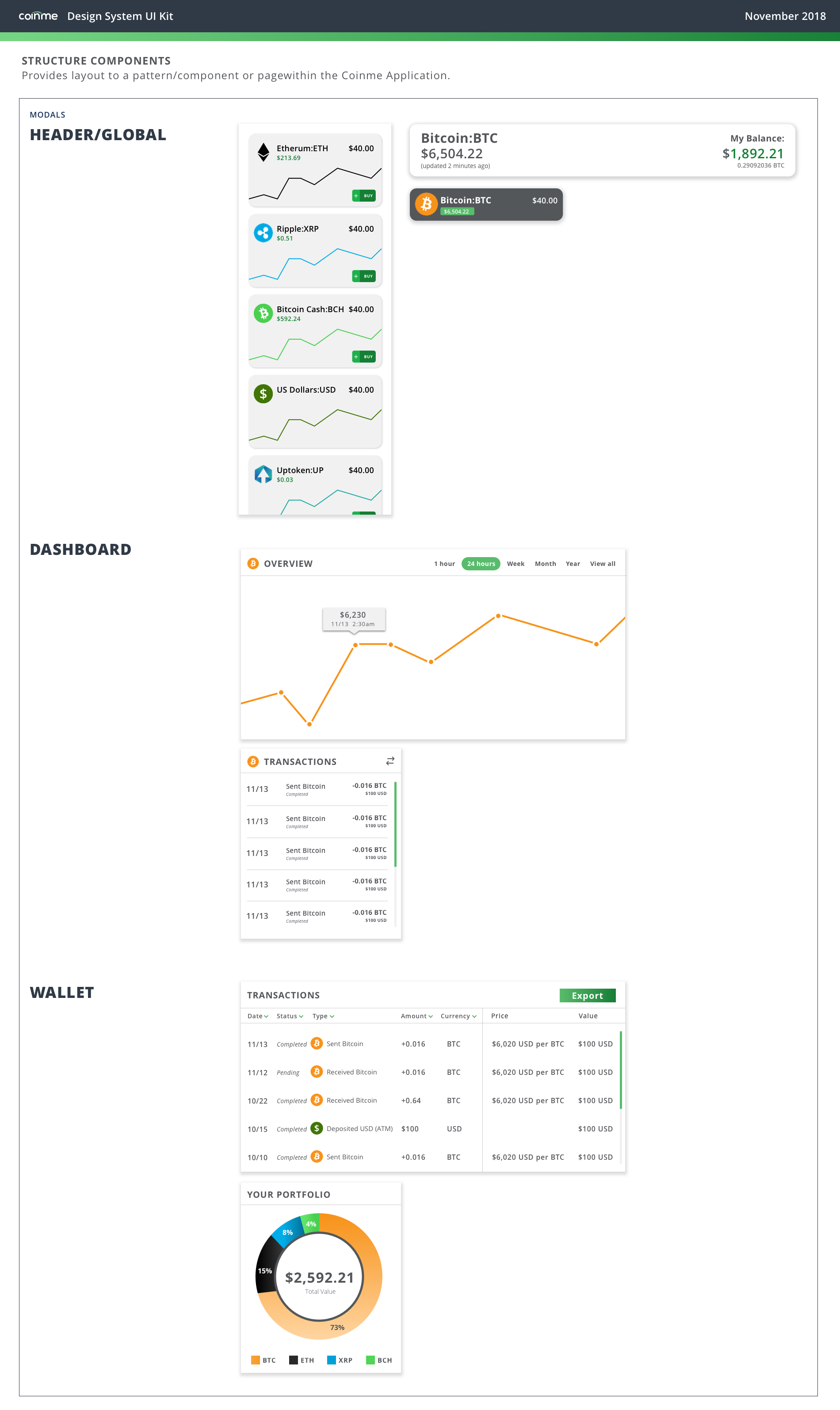
I used Adobe Illustrator and Sketch to create icons, illustrations, and UI kit as well as to design high fidelity comps showing how to combine the elements of the Coinme brand together.


Prototype
Interactive prototype delivered through Figma.