Event Gamification for a Developer Conference
Designing a web-based competition experience for CreatorCon at ServiceNow KnowledgeCreatorCon is ServiceNow’s developer-focused experience within its flagship Knowledge conference, bringing hands-on learning and live competition to a highly technical audience.
I designed the high-fidelity UI and visual system for the BrewOps competition, shaping a game-inspired experience that scaled across a live event environment.
Discovery + Research
- Create a game-like competition experience that actively engages developer teams while remaining entertaining for live event audiences.
- Balance high-energy, playful interaction with clarity and usability under time pressure.
- Design an experience that feels distinctly non-corporate, while still aligning with ServiceNow’s brand system and standards.
- Support a competitive yet collaborative atmosphere that reinforces CreatorCon’s community-driven spirit.
- Team structure designed for two developers and one builder, reflected throughout the UI.
- A locked task progression model, requiring teams to complete challenges sequentially.
- Real-time status updates to communicate competition progress across both team-facing and audience-facing views.
- Clear access for participants to view tasks, instructions, and progress at any point.
- A dynamic leaderboard system showcasing team performance and momentum.
- Clear post-registration guidance to help teams orient themselves within the event and next steps.
These attributes guided visual decisions, motion, hierarchy, and interaction patterns throughout the design.
- Fun - Approachable, playful, and rewarding to use
- Innovative - Reflective of modern developer culture and tools
- Educational - Reinforcing learning through hands-on challenges
- Energetic - Visually active without feeling chaotic
- Intentional - Designed with purpose, not novelty
- Engaging - Encouraging participation from both teams and spectators
- Connected - Bridging team activity, audience visibility, and event flow
- Progressive - Forward-looking and aligned with ServiceNow’s vision
Experience Strategy
The experience strategy was shaped around live, high-pressure event use—balancing the needs of active participants and surrounding audiences. By defining core journeys and audience roles, the experience stayed intuitive in the moment, scaled cleanly across screens, and remained cohesive throughout the event.
Experience Journeys
Journey mapping clarified key moments across participation and observation in a live event setting.

Primary User types
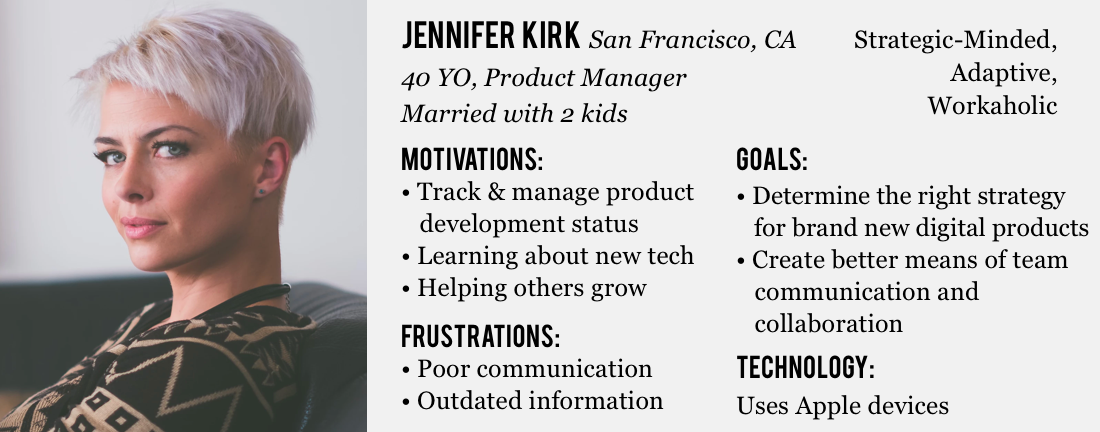
The experience was designed for both active participants and observing attendees, each with distinct needs.
Key Interaction Scenarios
Use Case 1:
Completing Competition Tasks
Actor:
Developer Team Member
User Flow:
Registers, logs in at an assigned table, completes a profile, and progresses through tasks once the competition begins.
Device:
13” Macbook Pro Laptop
Use Case 2:
Monitoring Team Momentum
Actor:
Developer Team Member
User Flow:
Switches from the task view to a team overview to check overall progress and see teammate activity in real time.
Device:
13” Macbook Pro Laptop
Use Case 3:
Viewing Live Competition Progress
Actor:
Event Attendee
User Flow:
Follows live standings and team activity on large-format displays without interrupting active participants.
Device:
Mounted Large format display screens
Use Case 4:
Exploring Project Details
Actor:
Event Attendee
User Flow:
Reviews project details on standing displays to learn more about the work teams are producing during the competition.
Device:
Standing large format display screens
Early Structure & Ideation
Early interaction structure and annotated flows from the Interaction Designer set the foundation for layout decisions. I used rapid sketching to explore hierarchy and composition before moving the work into high-fidelity UI.

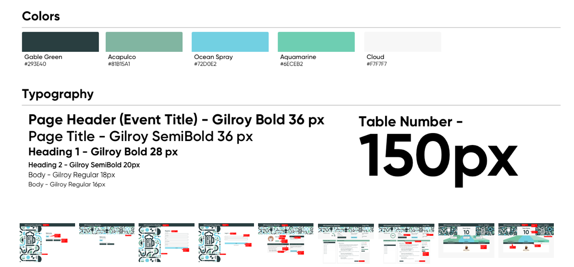
Design System & Deliverables
I designed the high-fidelity UI and visual system, applying game-inspired layout patterns to create a clear, cohesive experience for a live competition.
Style guide
A lightweight style guide established core visual patterns and components, ensuring consistency across the application and event displays.
Login, Registration, Profile page
A single entry flow supported both login and registration, quickly preparing participants to join their teams and move into active tasks once the competition began.

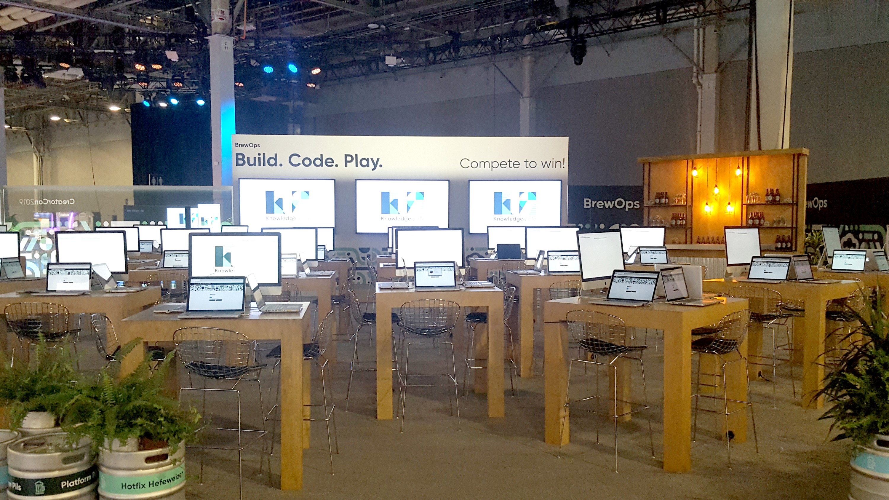
Position Task Board Screens
Game-inspired task boards visualized active challenges and team roles in a familiar, high-energy format—making progress and responsibility clear at a glance.

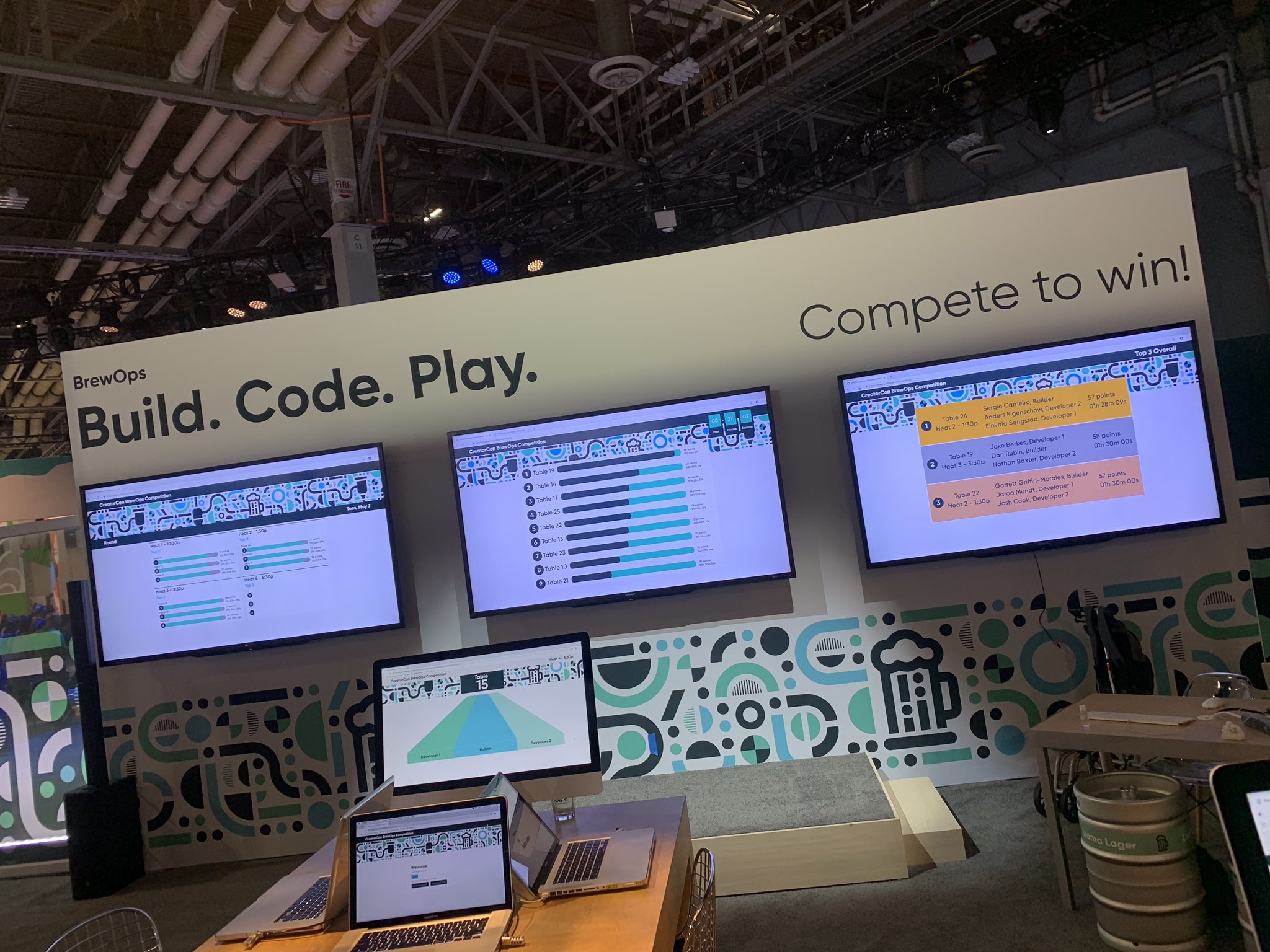
Leaderboard
The leaderboard surfaced live competition status using time and point-based progression, designed for quick comprehension on large-format displays so spectators could easily follow each heat.

Masterboard
The masterboard highlighted top-performing teams across completed heats, rotating results over time to reflect progress throughout the multi-day event.

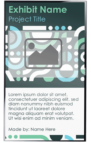
Presentation Display/signage
Supporting displays extended the experience to attendees, providing context around the projects and behind-the-scenes work without disrupting active teams.
Impact
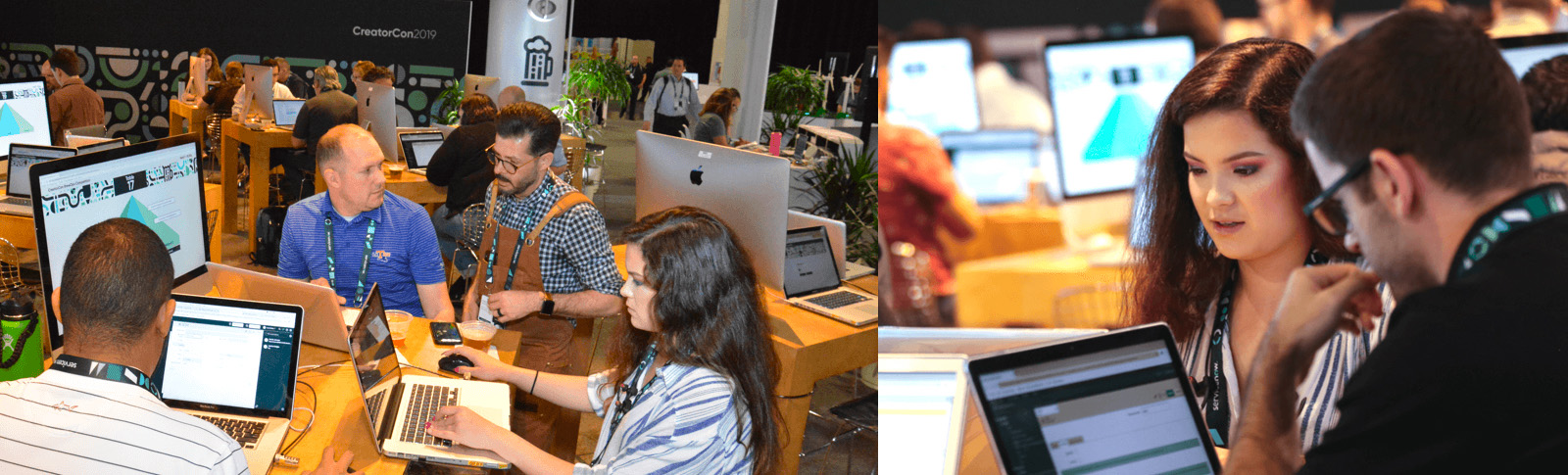
The BrewOps application was launched and used throughout ServiceNow Knowledge 2019, supporting live competition across multiple days and event surfaces. The experience successfully balanced real-time participation for developer teams with clear, engaging visibility for attendees.
Product in Action
[The following event photos were found through ServiceNow's website and public social media posts from attendees. They do not belong to me. All rights belong to their rightful owners.]