Digital Interface & Visual System Redesign
Updating the online visual branding for a growing electronics companyRF-Lambda is a global developer, manufacturer, and distributor of RF test equipment serving commercial, aerospace, and military customers. As the company scaled, its digital presence needed to communicate precision, trust, and technical clarity—especially for engineers, procurement teams, and enterprise buyers.
This case study focuses on the digital interface and visual system redesign—elevating the visual language, hierarchy, and brand expression of the website interface. The goal was to modernize the visual design while maintaining usability for a highly technical audience.
Note: For the full enterprise-level UX and interaction work, see: RF-Lambda — CX/UX + Interaction Design
Design Strategy
During discovery, it became clear that the existing visual approach did not support RF-Lambda’s market leadership or product complexity. The visual system lacked cohesion and hierarchy, which made it harder for users to scan technical content and trust the interface.
Insight from early research and stakeholder alignment pointed to three visual priorities:
- Establish clear visual hierarchy for technical data
- Align the interface with RF-Lambda’s brand credibility and product precision
- Create a flexible visual system to support future site growth
Pre-redesign website

Visual Direction Exploration
Multiple visual concepts were explored to test hierarchy, tone, and brand expression for a technical audience. One direction was aligned on and used as the foundation for the final visual system.
Visual Language & Principles
To support consistency across the interface, I established a clear visual language grounded in reusable components, typographic hierarchy, and interaction patterns. Rather than treating visuals as isolated screens, the goal was to define shared principles that could scale across the site while remaining clear and usable for a technical audience.
UI Style Guide
User Interface Design
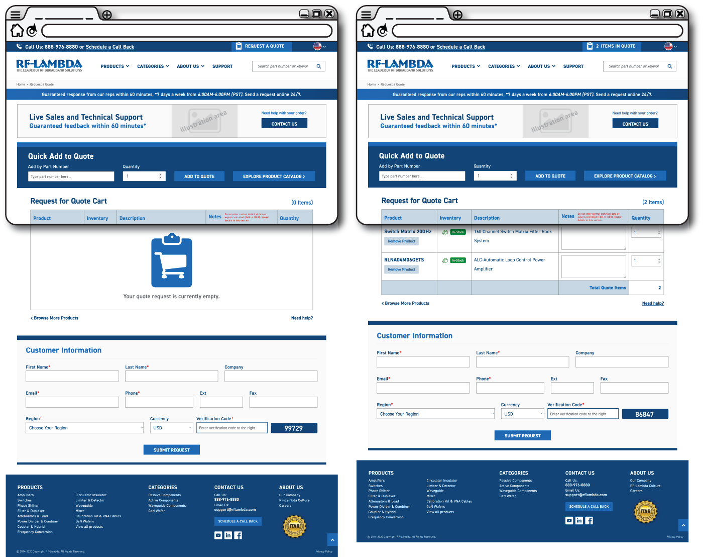
The interface design applied the visual system across core pages, emphasizing clarity, hierarchy, and trust for a technical audience. Accessibility considerations—such as contrast, spacing, and type scale—were built into the layouts to support readability and usability at scale.
Home Page
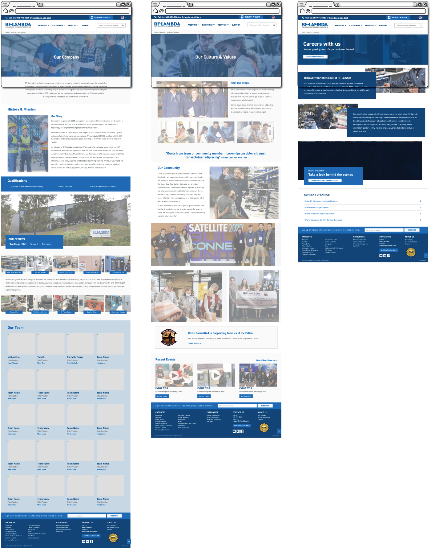
About Company | Culture | Careers Page
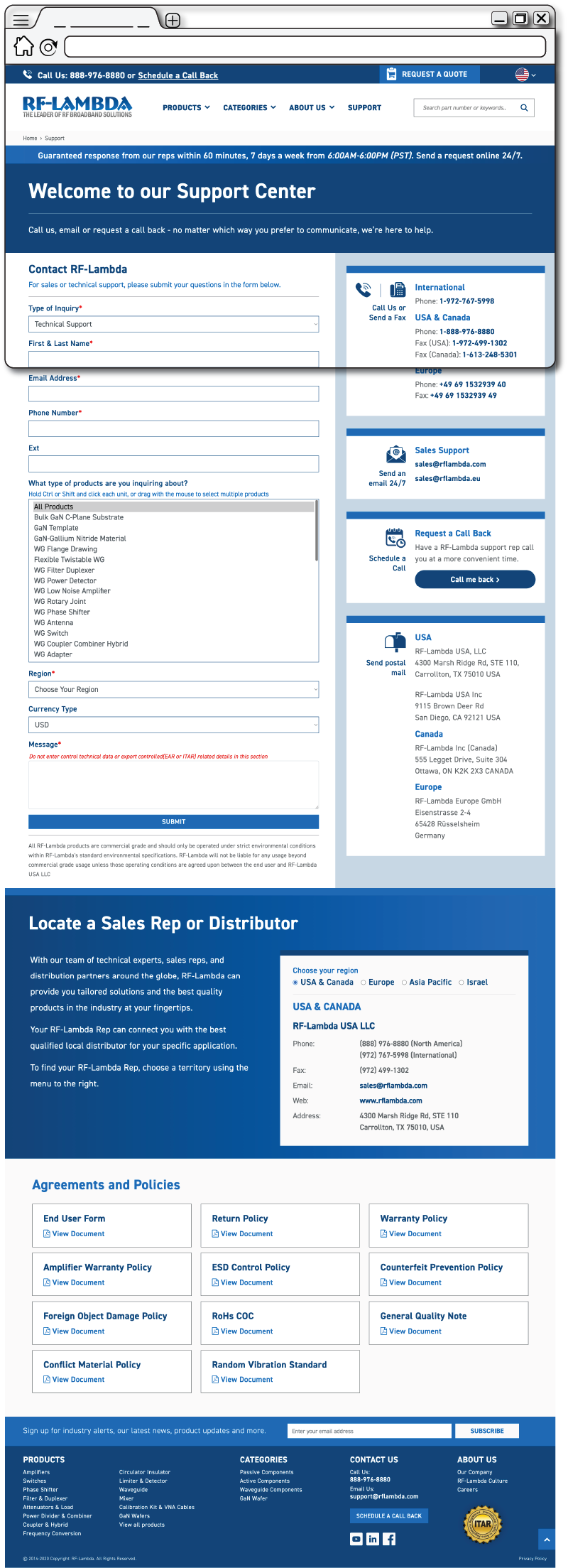
Support page
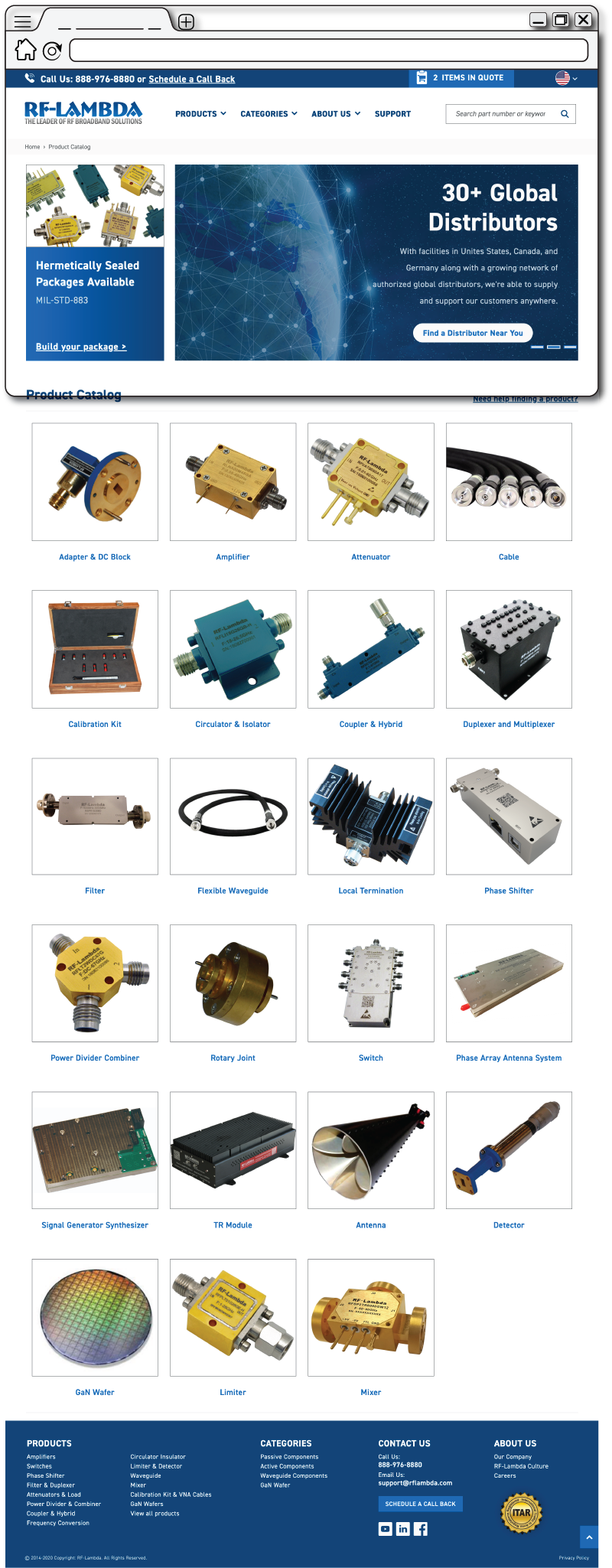
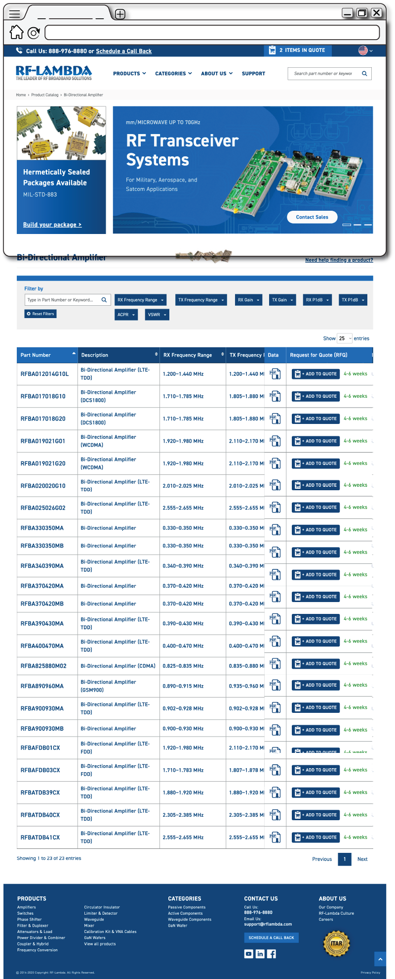
Product Catalog
Checkout Pages
News/Events (Blog)